ShopDreamUp AI ArtDreamUp
Deviation Actions


Comments18
Join the community to add your comment. Already a deviant? Log In
First I have to say that haven't written a critique in a very long while so I'm sorry if it becomes a bit confusing during your read.
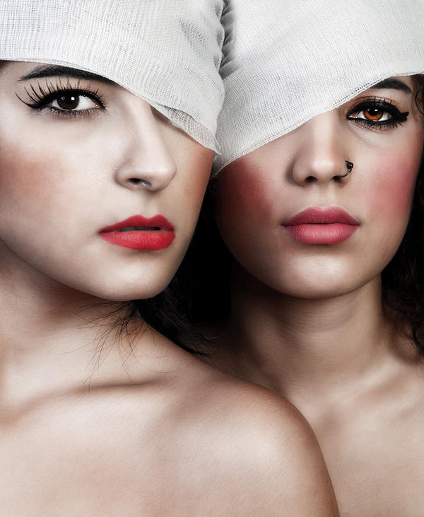
That said its time to talk about the picture itself, in short, I like it! I think you made it so that theres a lot going on in the picture without it jumping at you or being to evident, theres a lot behind the apparent stillness and simplicity.
I must say that at first I was confused by it, the title says Broken hearted girls but the photo isn't even framed to show the heart or it's place in the body (something most of the pictures about broken hears tend to do) and that got me engaged in figuring it out and understanding all the little details in the framing. Things like they're mouths being just a little bit open or the look in the eyes, even the fair skin tone complements the whole work.
But this being a critique I also have to point out things I don't really like, so here are a couple of them (because there aren't that many either way): the hair below the chin of the firs model is a little distracting, I guess it would ha worked better if it wasn't there, or if there were more in order for it look like it was on purpose, like this it looks to me like it was an over-site...
I also think this framing is a bit to tight, I believe a lot of benefit could come from a little more space between the models or opening up the image to the sides.
I guess thats all of it, In general I love this photo and the few things I said I didn't like do not mess with the way I read it or perceive it, I guess they're just small gripes...